Friday, August 26, 2005
Steal This Brand

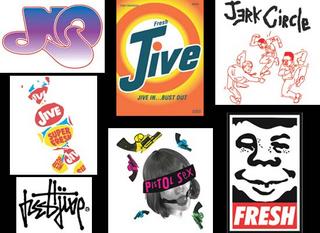
I’m sorry for the long delay in posting this. The vertebrae in my neck decided it would be fun to compress themselves and pinch a few of my nerves while they were at it. I’m on the mend now.I’ve been a loyal subscriber to WIRED for years, but sometimes the magazine gets on my nerves. They have a way of elevating the most mundane thing into something that’s creative, cool, and futuristic. Take the piece Eric Steuer wrote about Shepard Fairey and Rick Klotz—two young “remix entrepreneurs.”
The pair’s design formula is to appropriate iconic brands and drop them into a new context. Their Tide detergent box combined with the word “Jive” is a good example. Why did they do this? According to Klotz, they are acting on the same impulse that drives hip hop producers to use samples in their music. “It's about taking something you like and putting your own twist on it. If I take a logo and make a shirt out of it, I'm saying, Hey, this graphic that you see all the time is pretty cool looking if you draw out the right elements.”
So now, it seems, every corporate identity is fair game. Young entrepreneurs like Shepard Fairey and Rick Klotz are making money with other companies’ logos. But is that so bad? Look what Andy Warhol did with some Campbell’s Soup Cans and green Coca-Cola bottles (By the way,Coke owns one of Warhol's Coke bottles.
Would like to hear some other views on this.
Saturday, August 13, 2005
There's more to good design than just stealing it.
Design is not a strategy; it’s part of the brand. At least, according to designer Yves Béhar, founder of fuseproject, an integrated design firm dedicated to the development of the emotional experience of brands through story-telling. Béhar is dismayed at the vast amount of me too-ism in design that exists in the marketplace today. The problem is that many marketers think of design as an add-on, something to slap on the product at the end of the line. Or else something to copy.
That’s one way to look at it; here’s another: Remember the translucent plastic that Apple introduced with iMac? It kindled a new design craze. Suddenly, everything was see-through—from scrub brushes to staplers. So, the question is: Did Apple inspire other designers to work with translucent plastic or did other designers rip Apple off?
As I see it, the use of translucent plastic in product design will one day be viewed as a decorative art, just as mid-century modern, art deco, art nouveau, arts and crafts and the Aesthetic movement are. Each design period inspired a plethora of decorative objects and products, from exquisite to commonplace. Take Art Deco, for example. On one end of the scale there’s the Chrysler Building in New York City. On the other end, there are mirrored picture frames that you could buy at Woolworth’s for fifty cents or less. Both bear the unmistakable motifs of Art Deco design.
I guess we’ll call this the Apple period.
P.S. By the way, translucent plastic isn’t new. When I was kid (more than 50 years ago), squirt guns were made of it. (There were probably other things made of it back then, but squirt guns are all I can remember.)
Wednesday, August 03, 2005
New advances in fruit branding
It used to be that Chiquita brand bananas and Dole brand pineapples were the major labelers of fruit. But lately, colorful little labels have been popping up on everything from apples to zucchini. In addition to showing the country of origin, each tiny label sports the grower’s brand identity. There are hundreds of these unique labels from around the world. You can see them at The World of Fruit Labels You can trade them there as well, like people do with baseball cards.
By the way, you might want to start saving the labels you bring home from the grocery. They’re about to get scarcer. New laser technology is doing away with paper labels, branding the fruit’s skin directly.
By the way, you might want to start saving the labels you bring home from the grocery. They’re about to get scarcer. New laser technology is doing away with paper labels, branding the fruit’s skin directly.
