Tuesday, March 13, 2007
Mr. Clean finds his feminine side


Was the great-granddaughter of Mr. Clean.”
-Bob Dylan
What does Mr. Clean do in his off time? One can only guess. But based on the latest P&G brand extension, Mr. Clean Multi-Surfaces Liquid Cleaners , he might have been watching Oxygen, HGTV or Lifetime. Because these new products come in five fresh scents that according to the Mr. Clean Web site, “will leave your home and all the items in it clean and smelling great!” The scents are Ultimate Orange, Sparkling Apple, Summer Citrus, Invigorating Breeze and Spring Garden. Think household cleaner meets aromatherapy.
The point of all this? It just goes to show that brands can’t grow by being one-trick ponies anymore.

Another good example of how far you can extend a brand is Newell Rubbermaid's Sharpie® brand . They are in the midst of a brand renaissance, taking what was once a somber permanent black ink marker and raising it to a colorful, cult-like status.
Labels: brand, brand color, brand extension, brand personality, brand positioning, brand strategy


Tuesday, February 13, 2007
AT&T to Cingular: Hit the road “Jack”

One good thing—according to the folks at Strategic Name Development, they’re going about the transition in the right way. “AT&T's press release assures us that its efforts will "transfer Cingular's strong brand equity to the new AT&T." I think that, as reported in AdWeek, the brand transition technique AT&T is employing in its advertising to transition from the Cingular
 brand to the AT&T brand will enhance its chances of a successful brand name transition.
But what about poor Jack? Will he be sold like the sock puppet? He could certainly pep up a bank or a fast food chain. Perhaps AT&T will list him on eBay. Stay tuned.
Labels: brand, brand personality, brand positioning, name, sock puppet
Wednesday, February 07, 2007
Add a little chaos to your brand strategy
“My personal experience with music/DJs/underground culture, which is largely driven by word of mouth, has made me skeptical of any model that simplifies the process by which new ideas spread. I have repeatedly found that the process of finding stuff out, making things more popular, going from underground to mainstream, takes place in a very chaotic manner, and is nearly impossible to predict. The real world does not follow theory.”
It's worth a read.
Labels: brand, brand personality, brand strategy, viral marketing
What color is your carton?

Here’s one that is, however: CB2. They’re a division of Crate and Barrel, only they skew younger and hipper. Basically, they offer cool design at an affordable price. Or as they describe themselves on their Web site:

By the way, for an in-depth look at the Tiffany and Co, brand, go to:
Says Ms. Blackburn,
“Upon realizing the strength of its brand and the image its blue box portrays, Tiffany also plans to continue launching new product lines, taking advantage of the growing popularity of branding among jewelry consumers today.”
Labels: brand, brand color, brand personality, brand positioning, brand strategy, CB2, packaging, Tiffany and Co
Sunday, December 10, 2006
Seeing red -- a problem of brand convergence
 I think it started with Target, or at least, that’s when I first noticed it: the color red. It was a subtle clue that you were watching a Target spot. It was effective. So much so, that virtually every department store has added a red element to its brand identity. Some department stores have also adopted the quirky look and personality of Target’s broadcast spots in their own advertising. The result: you don’t know if it’s a Kohls spot or a Target spot until the very end. That can backfire. For example, if the viewer associates the Kohls spot he or she is watching with the Target brand in any way, Kohls just wasted its money, and Target got some free advertising.
Here’s another, more recent example of the perils of brand convergence. This time it started with a series of clever spots by Apple Computer. The messaging uses two people as metaphors for the PC and Mac. The dialogue between the two exposes the problems and inefficiencies of using a PC.
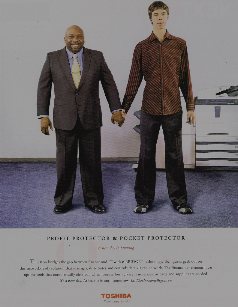 No sooner was that on the air, than Toshiba launched a print campaign for their advanced copier technology. Look familiar? The concept is right off Mac’s page. I wonder how many business magazine skimmers will associate the Toshiba ad with Mac on the strength of its visual? I did, for one.